
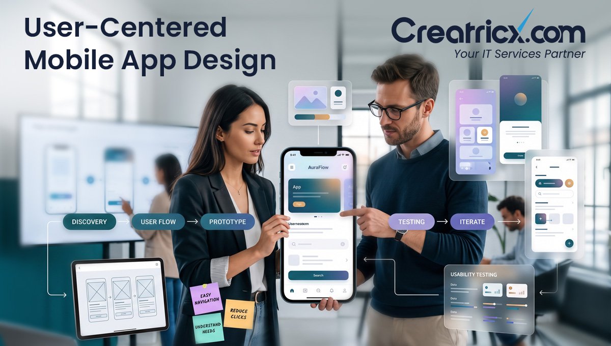
User-centered design is an essential component of mobile app development because it helps teams create applications that meet the actual needs, behaviours, and expectations of their users. It improves usability, decreases friction, enables accessibility, improves retention, and helps users accomplish key actions within the app like signing up, buying, booking, learning, or managing tasks.
Key Takeaways
- User-centered design ensures that mobile apps are intuitive, easy to use, and functional from the very first interaction
- A mobile app can be very powerful but it can still be a failure because users get confused, feel slowed down, or have a hard time using it
- Good user experience (UX) takes the friction out of onboarding, forms, navigation, checkout, booking, and other key user actions
- User-centered design is better at retaining users, because an application that solves their problem without asking them to do too much is more likely to bring them back
- Accessibility should be part of the mobile app design process, not an afterthought tacked on at the end
- By testing with real users, teams can catch issues early, avoid costly rework, and build an application that reflects how users actually behave
- For businesses, creating user-centric mobile apps can increase trust, customer satisfaction, conversions, and long-term product value
What Does User-Centered Design Mean in Mobile App Development?
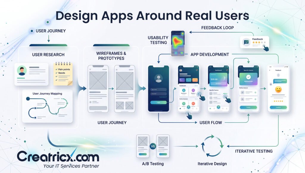
User-centered design in mobile app development means designing and building an app with the user in mind. It focuses on their expectations, limitations, habits, problems, and goals before the design or development decisions have been made.
This is a different methodology to feature-first development. For a feature-first application, the starting point is a list of things the business wants to have. A user-centered application begins by asking what tasks users need to perform, what problems they may have, and how the application can help them accomplish these tasks with minimum effort.
| Aspect | Feature-First Approach | User-Centered Approach |
| Starting point | A list of features the business wants built | Real tasks and problems users actually have |
| Design decisions | Based on internal priorities and opinions | Based on user research, journey mapping, and testing |
| Main risk | Features nobody uses, and costly rework later | Lower risk of building the wrong thing |
| Success measure | Whether the feature got built | Whether users can complete their task easily |
For example, a food delivery app is not simply about payment gateways, menus, and order tracking. The user's main goal is pretty simple: find the food, order it quickly, get an estimated delivery time, and avoid any nasty surprises. User-centric design means each screen supports that journey, rather than turning dinner into a software endurance test.
User-centered mobile app design involves user research, journey mapping, wireframes, prototypes, usability testing, accessibility planning, and continuous improvement after the project launches. The point isn't to make the app look nice. The goal is to make the application user-friendly, clear, and practical in real-life situations.
User-centered design isn't the same as user testing tacked on at the end of a project. It should shape decisions from the very first discovery conversation, not arrive as a final check before launch.
Why User-Centered Design Matters for Mobile Apps
Mobile users have low tolerance for ambiguity, so designing for the user is essential. Applications should load fast, be easy to understand, and do what they're supposed to do with no extra steps. If an app is difficult to use in the first few minutes, many users will close it right away and move on to other options.
Mobile Users Decide Quickly
Mobile apps are used in short, focused moments. A user may open an app while commuting, shopping, waiting for an appointment, comparing options, or trying to complete something quickly. That means the app has very little time to prove its value.
If the first screen is unclear, the navigation feels messy, or the user doesn't know what to do next, the app creates doubt. User-centered design reduces that doubt by making the next step obvious.
Good UX Reduces Friction
Friction appears when users have to work harder than expected. It can show up as long forms, confusing menus, unclear buttons, slow loading screens, hidden information, or error messages that explain nothing, which is a heroic failure of communication.
A user-centered mobile app removes unnecessary effort. It uses simple navigation, clear labels, short forms, helpful prompts, visible actions, and smooth screen flows, so users can complete tasks without stopping to decode the interface.
Better Design Improves Retention
Getting users to download an app is just the first step. The main challenge is making sure they come back. If users find value in the experience and can easily complete key tasks, they're more likely to keep using the app.
User-centered design improves retention because it makes the app feel useful right from the beginning. Good onboarding, relevant notifications, clear progress tracking, and intuitive access to useful features all help build user confidence and encourage repeated use.
User-Centered Design Supports Conversions
All mobile apps have core actions they want the user to perform. This could be creating an account, booking a service, ordering a product, subscribing to a plan, filling out a request form, or getting help.
User-centered design makes this possible. It reduces clutter, builds trust, clarifies the options, and guides the user seamlessly to the next step. When users know what they're doing and why it matters, they're more likely to complete the task, rather than leaving halfway through.
Business Benefits of User-Centered Mobile App Design
User-first design isn't just a design decision. It's a business decision. If a mobile app is easier to use, people are more likely to trust it, come back to it, and do the things the business needs them to do. Users love not having to suffer through bad products.
Less Wasteful Development
Without a user-centered approach, teams waste time and money building features the user doesn't need, understand, or use. That creates development waste even before the app hits the market.
User research, wireframes, and prototypes let companies test ideas early. Teams can figure out what users actually need and build around those priorities, rather than guessing what features matter. This sharpens the development process and reduces the risk of wasting money on functionality nobody needed.
Cut Down Future Redesign Costs
Fixing bad UX after launch usually costs more than planning the experience well before development starts. Once an app is built, changing user flows, navigation, screens, and core features can require additional design work, development time, testing, and budget.
A user-centered approach finds problems sooner. Businesses can avoid major redesigns and launch with a stronger foundation by testing layouts, journeys, and key actions before full development.
A redesign after launch almost always costs more than getting the experience right the first time, since it means unpicking flows, screens, and features that are already live and in use.
Stronger Brand Trust
Users judge a business by the experience its app provides. If the app feels confusing, outdated, slow, or unreliable, people may assume the business behind it is the same. Brutal, but phones have trained everyone to make decisions in seconds.
A clean, useful, and well-structured app builds trust. It shows that the business understands its users, respects their time, and takes the digital experience seriously.
Better Customer Satisfaction
When users can complete tasks easily, they're less likely to feel frustrated, contact support, abandon the app, or leave negative reviews. Clear navigation, helpful messages, smooth onboarding, and accessible design all contribute to a better customer experience.
For businesses, this can mean higher retention, fewer support issues, better reviews, stronger engagement, and more value from the mobile app over time.
7 Core Principles of User-Centered Mobile App Design
User-centered mobile application design is based on pragmatic principles that allow teams to develop applications people can understand, trust, and use easily. It isn't merely about visually attractive displays. The aim is to make every interaction clear, useful, and easy to complete.
1. Understand the User Before Designing
Good mobile app design starts with understanding the people who will use the app. Before creating screens, teams need to know:
- Who the users are
- What problem they want to solve
- What actions they need to complete
- Where they may feel confused or frustrated
- How comfortable they are with technology
- Which devices, screen sizes, and usage situations matter most
A business app used by employees during work hours needs a different experience to a fitness app used between workouts. A healthcare app needs more clarity and reassurance than a shopping app. User-centered design begins by understanding these differences before the interface is designed.
2. Keep Navigation Simple
Mobile screens are small, so navigation must be clear and focused. Users should be able to understand where they are, what they can do next, and how to return to important sections without feeling lost.
Simple mobile navigation should include:
- Clear menu labels
- Logical screen hierarchy
- Easy access to core features
- Familiar navigation patterns
- Visible back, close, or cancel options
- Minimal unnecessary screens
If users need a treasure map to find the main feature, the app has already lost the plot.
3. Design for Thumb-Friendly Interaction
MoThe majority of mobile phone users interact with them mostly with their thumbs, often with only one hand. Clickability: Buttons, forms, menus and other important things should be easy to click on. This way, people won’t click on them by accident or move in strange ways.
- Thumb friendly design:
- Target size of sufficient magnitude
- Correct spacing between buttons
- Text suitable for small screens
- Core simple to access actions
- User-friendly form fields.
- Avoid crowded layouts
And this is very important for things like payment screens, filters, shopping carts, book a thing buttons and login forms.
4. Make Onboarding Short and Useful
Onboarding should make it easy for users to understand the app and get value as soon as they can. Don’t make a long feature tour that explains every button like the user signed up for a software certification class.
A successful onboarding process should involve the following:
- State the main advantage of the app right away.
- Ask only for what you need.
- Please state the reason for the permission request.
- Direct users to the first helpful action.
- Prevent the user from being overwhelmed by too many screens.
- Let your users skip unnecessary steps wherever possible.
The goal is simple: help users start using the app, not trap them in an introduction nobody asked for.
5. Use Clear Language
Mobile apps content should be simple, easy and understandable. This includes button text, form labels, error messages, empty states, notifications, instructions, and confirmation messages.
However, the language is clear enough for the user to infer what happens next. For example,
- Use "Create Account" instead of "Submit"
- Use "Book Appointment" instead of "Proceed"
- Use "Add to Cart" instead of "Continue"
- Use "Save Changes" instead of "Confirm"
- Use "Try Again" instead of vague error text
Good microcopy reduces confusion and makes the app feel more trustworthy.
6. Build Accessibility Into the App
Accessibility is part of user-centered design, not something to add later once someone remembers that users aren't all identical. A mobile app should be usable by people with different abilities, devices, screen sizes, and interaction needs.
Accessible mobile design should consider:
- Readable font sizes
- Strong colour contrast
- Screen reader support
- Meaningful button and image labels
- Clear focus states
- Proper touch target sizes
- Captions or alternatives for audio and video
- Avoiding colour-only instructions
- Reduced motion options where needed
Accessible apps aren't only more inclusive. They're usually easier for everyone to use.
7. Test With Real Users
Even experienced teams can make wrong assumptions. User testing helps reveal where people get confused, where they hesitate, and where they abandon a task.
Useful testing methods include:
- Clickable prototype testing
- Usability sessions
- In-app analytics
- User surveys
- Heatmaps and session recordings
- App store review analysis
- Support ticket review
- Post-launch feedback loops
The goal is to improve the app based on real evidence, not internal opinions shouted confidently in a meeting. Testing shows what users actually do, not what the team hoped they would do.
9 Common Mistakes When Apps Aren't User-Centered
When mobile apps aren't designed around users, the problems usually show up quickly. People get confused, leave tasks unfinished, delete the app, or avoid using it again. Very efficient, if the business goal was to lose users with confidence.
Here are the most common mistakes businesses and development teams should avoid.
1. Designing for the Founder Instead of the User
Many apps fail because they're designed around what the founder, manager, or internal team prefers, instead of what users actually need.
This usually leads to:
- Too many features on the first screen
- Confusing journeys based on internal logic
- Technical language users don't understand
- Priorities that make sense to the business but not to the user
- Screens that look impressive but don't help users complete tasks
A user-centered app isn't built around internal opinions. It's built around real user behaviour.
2. Adding Too Many Features Too Early
More features don't always make an app better. In many cases, they make the app harder to understand and more expensive to build.
Feature overload can create:
- Cluttered screens
- Longer development timelines
- Higher testing complexity
- Confusing navigation
- Slower onboarding
- Poor focus on the app's main purpose
A better approach is to start with the core features users need most, then improve the app based on feedback and usage data.
3. Copying Competitor Apps Blindly
Looking at competitors can be useful, but copying their app without understanding your own users is risky. A feature that works for another business may not work for your audience, pricing model, industry, or customer journey.
Blind copying can lead to:
- Unnecessary features
- Weak differentiation
- Poor user fit
- Confusing flows
- Missed opportunities to solve problems better
Competitor research should guide decisions, not replace user research. Shocking that copying homework still causes problems, but here we are.
4. Using Confusing Icons Without Labels
Icons can make an app look clean, but they aren't always easy to understand. If users have to guess what an icon means, the design is creating friction.
This is common with:
- Navigation icons
- Action buttons
- Settings menus
- Filter controls
- Dashboard shortcuts
- Profile and account actions
When an icon isn't universally clear, adding a short label can make the app easier to use.
5. Making Onboarding Too Long
Onboarding should help users get started. It shouldn't delay them from using the app.
Poor onboarding often includes:
- Too many intro screens
- Long explanations before users see value
- Unnecessary account setup steps
- Permission requests without explanation
- Feature tours that users forget immediately
A better onboarding flow focuses on the first useful action. Help users experience value early, then explain more when they actually need it.
6. Asking for Too Much Information Too Soon
Users are less likely to complete registration or checkout when an app asks for too much information upfront. Nobody opens an app hoping to fill out a digital census.
This mistake often appears in:
- Long sign-up forms
- Checkout screens
- Booking forms
- Profile setup
- Lead generation forms
- App permission requests
A user-centered app asks only for what's necessary at that stage. Extra details can be collected later, once users have more trust and context.
7. Ignoring Accessibility
Ignoring accessibility means excluding users who may have visual, motor, cognitive, hearing, or situational limitations. It also makes the app harder to use for everyone else.
Common accessibility mistakes include:
- Low colour contrast
- Small text
- Tiny tap targets
- Missing screen reader labels
- Using colour alone to show meaning
- Complicated instructions
- Motion effects that can't be reduced
- Forms that are difficult to navigate
Accessibility should be part of design and development from the start, not treated as a last-minute patch.
Ignoring accessibility doesn't just exclude some users, it usually makes the experience harder for everyone, since features like clear labels, sufficient contrast, and simple navigation benefit all users, not just those with specific needs.
8. Skipping User Testing
Skipping user testing is one of the fastest ways to launch an app based on assumptions. The team may think a flow is obvious, but real users may hesitate, misunderstand labels, miss buttons, or abandon the process.
User testing helps reveal:
- Confusing screens
- Broken journeys
- Unclear instructions
- Unnecessary steps
- Weak onboarding
- Form issues
- Navigation problems
Even a small round of usability testing can uncover problems before they become expensive post-launch fixes.
9. Treating UI Design as Decoration Only
A mobile app's interface is not just decoration. UI design affects how users move, read, decide, trust, and take action.
When UI is treated only as visual styling, teams may ignore:
- Information hierarchy
- Usability
- Accessibility
- User flow
- Content clarity
- Error prevention
- Conversion paths
- Task completion
Good UI supports the user journey. It makes the app easier to understand, not just nicer to look at.
How User-Centered Design Fits Into the Mobile App Development Process
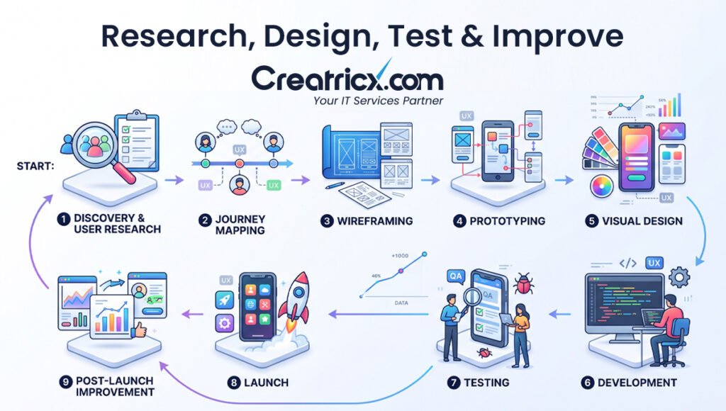
User-centered design is not a single step that happens before development and then disappears. It should guide the full mobile app development process, from early planning to post-launch improvement. When the process is user-centered, every major decision is connected to what users need, how they behave, and what the app is supposed to help them achieve.
1. Discovery and User Research
The process starts with understanding the users, the business goals, and the problem the app needs to solve. This stage helps the team avoid guessing, which is good, because guessing is how many app budgets go to die quietly.
During discovery, teams usually define:
- Target users and audience segments
- User pain points and expectations
- Business goals for the app
- Core app features
- Competitor strengths and weaknesses
- Technical requirements
- Security, privacy, and accessibility needs
- Success metrics such as sign-ups, bookings, purchases, retention, or engagement
The goal is to create a clear foundation before design or development begins.
2. User Journey Mapping
User journey mapping shows how people will move through the app from their first interaction to the final action they want to complete. This could be creating an account, placing an order, booking a service, completing a lesson, or managing a dashboard.
A user journey map helps identify:
- What users want to achieve
- Which screens they need to move through
- Where confusion may happen
- Which actions should be simplified
- What information users need at each step
- Where trust signals, confirmations, or support prompts should appear
This makes the app flow easier to plan before screens are fully designed.
3. Wireframing
Wireframes are simple screen layouts that show the structure of the app before visual design is added. They help teams focus on layout, navigation, content hierarchy, and user actions without getting distracted by colours, images, or branding.
Wireframes are useful for planning:
- Home screens
- Navigation menus
- Forms
- Product pages
- Booking flows
- Dashboards
- Checkout screens
- Profile sections
- Error and confirmation screens
This stage helps teams catch usability issues early, before development begins and every small change suddenly requires meetings, tickets, and someone sighing into a keyboard.
4. Prototyping
A prototype is an interactive version of the app experience. It allows users, stakeholders, and developers to test how the app will feel before the final product is built.
Prototyping helps teams check:
- If users understand the flow
- If buttons and actions are clear
- If onboarding feels too long
- If forms are easy to complete
- If important features are easy to find
- If users can complete key tasks without help
This reduces the risk of building an app that looks good in a presentation but collapses the moment a real person tries to use it.
5. UI Design
Once the structure and flows are clear, UI design turns the app into a polished visual experience. This includes colours, typography, spacing, icons, buttons, cards, forms, and visual hierarchy.
A user-centered UI should be:
- Easy to scan
- Consistent across screens
- Accessible on different devices
- Clear in both light and dark environments
- Aligned with the brand
- Designed around user actions
- Comfortable for repeated use
Good UI design doesn't just make the app look professional. It helps users understand what matters and what to do next.
6. Development
During development, designers and developers work together to turn validated user flows into a working mobile app. A user-centered process helps developers build with clearer priorities, because the main screens, interactions, and user actions have already been planned.
This stage includes:
- Front-end mobile app development
- Back-end development
- API integration
- Database setup
- User authentication
- Payment or booking integrations
- Push notifications
- Accessibility implementation
- Performance optimisation
- Security and privacy controls
The goal is to build an app that works smoothly, not just an app that technically exists. A chair with three legs technically exists too. Nobody wants to sit on it.
7. Testing and Improvement
Testing should continue before and after launch. A user-centered app is improved through real feedback, usage data, bug reports, and changing user needs.
Testing and improvement may include:
- Functional testing
- Usability testing
- Accessibility testing
- Performance testing
- Device and screen-size testing
- App store feedback review
- Analytics tracking
- User surveys
- Support ticket analysis
- Regular updates after launch
The best mobile apps keep improving after release. Launch is not the finish line. It's the point where real users arrive and politely expose everything the team missed.
Teams that treat user-centered design as an ongoing process, not a one-off design phase, consistently ship apps with fewer post-launch surprises and stronger user retention.
7 Examples of User-Centered Design in Mobile Apps
User-centered design becomes easier to understand when you look at real app situations. Different industries have different user needs, but the principle stays the same: the app should help people complete important actions with clarity, speed, and confidence.
E-Commerce App
In an e-commerce app, users want to find products, compare alternatives, place orders, and track deliveries without any hassle. They're not there to figure out confusing menus, or navigate a checkout maze designed by someone who clearly enjoys causing frustration.
An e-commerce app focused on user experience should let users:
- Quickly find products
- Use filters that actually help
- Clearly review product specifications
- Compare prices, sizes, colours, or specifications
- Add items to the cart easily
- See delivery costs and timeframes upfront
- Complete an order in just a few clicks
- Check order status after purchasing
If users are consistently abandoning their cart, it may be more than just the price. The problem could be a long checkout form, hidden delivery costs, unclear return policies, or an untrustworthy-looking payment process.
Healthcare App
Users of healthcare apps may be stressed, anxious, elderly, visually impaired, or in a hurry, which requires more care in the design. A user-centric healthcare app is concerned with transparency, confidentiality, accessibility, and user confidence.
A good healthcare app should help users:
- Book appointments easily
- Know what services are available
- Receive timely notifications
- Access clear medical guidance
- Manage prescriptions or records
- Contact support when needed
- Trust that their personal data is secure
- Use accessibility features comfortably
Patients don't want to go through five uncertain screens just to make an appointment and pick a date and time. The journey should be smooth, simple, and reliable.
Finance App
Finance apps depend heavily on trust. Users need to feel secure, informed, and in control when checking balances, transferring money, reviewing transactions, or managing payments.
A user-centered finance app should provide:
- Clear account information
- Simple transaction flows
- Plain language instead of confusing financial jargon
- Strong but usable authentication
- Clear confirmation messages
- Easy access to support
- Visible security signals
- Helpful alerts and transaction updates
For example, after sending money, the app should clearly show if the transaction was successful, pending, or failed. Vague messages in finance apps are not "minimalist." They are panic generators with icons.
SaaS Mobile App
A SaaS mobile app often supports users who need quick access to dashboards, notifications, reports, tasks, or team updates. These users may not want the full desktop experience squeezed into a tiny screen like a spreadsheet being punished.
A user-centered SaaS mobile app should focus on:
- The most important user actions
- Simple dashboard summaries
- Clear alerts and notifications
- Easy task management
- Fast search or filtering
- Role-based access where needed
- Clean data visualisation
- Smooth switching between key sections
For example, a project management app doesn't need to show every advanced setting on mobile. It should help users check updates, respond to tasks, review progress, and take quick action without overwhelming them.
Booking or Service App
Apps for booking appointments, reservations, consultations, repairs, events, classes, and local services all share a simple user goal: select a service, select a time, verify details, get confirmation.
A user-centric booking app should let users:
- Choose a service
- Check available dates and times
- Understand price or service details
- Provide just the essential information
- Postpone or cancel where possible
- Receive notifications
- Notify the provider of any changes
If users are frequently dropping out of the booking process, the problem could be unclear pricing, too many required fields, a badly designed calendar, or not enough confirmation before final submission.
Education or Learning App
Educational apps should support user motivation and help them progress. A good educational app should be easy to use, reduce ambiguity, and make the next step feel attainable.
A good educational app should have:
- Organised lessons
- Visible progress monitoring
- Short, focused training sessions
- Good reminders
- Smooth movement between modules
- Practice exercises or short tests
- Positive reinforcement
- Accessibility for various learning needs
If learners can see their progress, know what the next step is, and easily get back to where they left off, they're more likely to keep learning.
On-Demand Service App
On-demand apps, such as delivery, ride booking, home services, or repair apps, depend on speed, visibility, and trust. Users want to know what's happening and when.
A user-centered on-demand app should provide:
- Fast service selection
- Clear location input
- Real-time status updates
- Transparent pricing
- Easy communication
- Accurate estimated times
- Simple cancellation or support options
- Clear completion confirmation
For example, if a user books a service, the app should clearly show who is coming, when they'll arrive, what it will cost, and what to do if there's a delay. Mystery is great in novels. Less great when someone is waiting for a technician.
Final Thoughts
User-centered design is not just a design preference. It's one of the main reasons a mobile app feels useful, trustworthy, and worth keeping.
When an app is built around real user needs, people can:
- Understand the app faster
- Complete tasks with less friction
- Trust the experience more easily
- Return to the app more often
- Feel confident using its features
A successful mobile app is not built around features alone. It's built around the people who need to use it. Ignore that, and the app may still launch, but users will quietly uninstall it like they're taking out digital trash.
Frequently Asked Questions
What is user-centered design in mobile application development?
User-centered design in mobile app development is an approach that focuses on the needs, goals, habits, and expectations of real users during the planning, design, and construction phases of the app. It shapes how simple the app feels, how easy it is to understand and navigate, and how useful it is for everyday purposes.
Why is user-centered design important for mobile apps?
With mobile users expecting fast, coherent, and seamless experiences, user-centered design is critical. Users will quickly abandon applications that are confusing, slow, or difficult to use. A user-centered approach improves usability, trust, retention, and the overall performance of the application.
How does user-centered design improve retention in applications?
User-centered design improves retention by adding more usability and value to the application. Good onboarding, easy navigation, real value features, and smooth interactions all help keep users engaged, because the app is solving their problems instead of creating headaches.
Is user-centered design only concerned with the user interface?
No, user-centered design isn't only about the visual aspects of an application. It covers user research, journey mapping, wireframing, prototyping, accessibility, usability testing, content clarity, development choices, and post-launch improvements.
At what stage should UX design start in a mobile app project?
UX design needs to happen before development begins. The best time to design a user experience is at the discovery and strategy stage, when the team defines the purpose of the app, target audience, key features, and main user journeys.
How can a business know if their app is user-centered?
Businesses can gauge how user-centered an app is through usability testing, interactive prototypes, user feedback, app analytics, surveys, support tickets, session recordings, and app store reviews. These methods identify user problems and areas for improvement.
What happens if a mobile app doesn't follow user-centered design?
If a mobile app isn't built with the user in mind, people may find it difficult to complete tasks, abandon the app, leave negative reviews, submit more support tickets, or switch to a competitor. The app might work technically, but that doesn't guarantee it holds anyone's interest.
What role does accessibility play in mobile app UX?
Accessibility is a core part of mobile app user experience. It helps people of different abilities use the application, through readable text, strong colour contrast, screen reader compatibility, clear labelling, sufficient touch targets, and simple navigation. Accessible apps are usually easier for everyone to use.
Disclaimer
This article reflects general industry practice around user-centered design and mobile app development as of 2026, alongside Creatricx's published service model. Individual project scope, timelines, and costs vary by business and requirements. Always confirm current terms directly with any provider before starting a project.